COLOR NOTES / 02
Soft Summer or
Soft Autumn?
Both palettes emphasize softness. The useful shopping question is how a muted color leans—not whether a retailer calls it sage, rose or taupe.
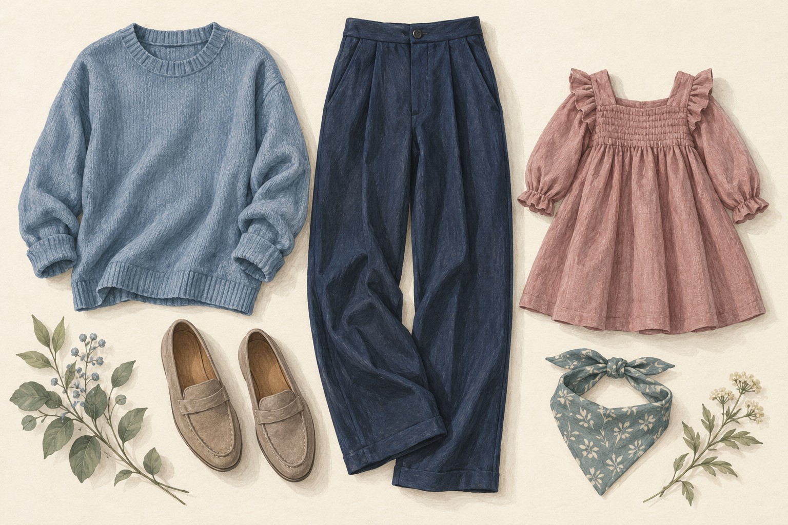
AI-generated styling inspiration—not actual products. Numbered items link to similar real products. Unnumbered pieces have no reviewed match. Compare product details
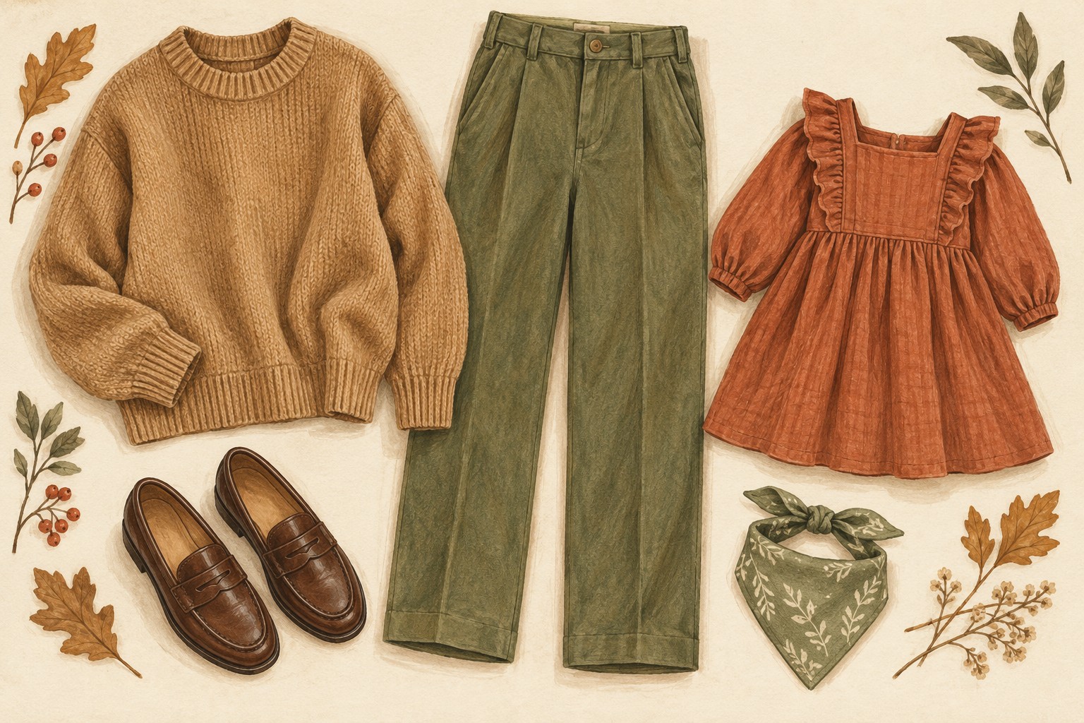
AI-generated styling inspiration—not actual products. Numbered items link to similar real products. Unnumbered pieces have no reviewed match. Compare product details
Compare the cool and warm moods—not exact seasonal color matches.
Start with what they share
In the twelve-season framework used here, both Soft Summer and Soft Autumn favor muted colors over very clear, intense ones. Their ranges can appear close in a photograph. “Muted” describes reduced intensity: imagine a vivid color softened toward gray rather than simply made lighter.
Lightness and softness are different. A pale color can still look clear and bright; a medium-depth color can be beautifully muted. Look at both qualities before deciding that a pastel belongs to either palette.
Then compare temperature
Soft Summer is generally cooler in this framework; Soft Autumn is generally warmer. Try comparing a gray-blue green with a yellowed sage, or a cooler dusty rose with a peachier rose. These are relative comparisons, not guarantees about every item carrying those names.
A cooler direction
Blue-gray green, dusty rose, softened navy. Consider these as starting points for Soft Summer.
A warmer direction
Yellowed sage, muted peach, soft olive. Consider these as starting points for Soft Autumn.
Illustrative screen colors only; these are not calibrated season swatches.
Keep the comparison fair
Compare similar materials and photographs when possible. A shiny satin catches highlights differently from a matte cotton. A warm room, a tan model background or a yellow studio light can make a cooler garment appear warmer. Check multiple product views and avoid judging solely from a thumbnail.
A neutral like taupe is particularly ambiguous. One version can lean pink-gray and another yellow-brown. Rather than treating taupe as automatically suitable, look for that undertone in the actual fabric beside a trusted palette reference.
Use a short shopping decision
- Is the item softly colored rather than strongly saturated?
- Compared with your own reference, does it lean cooler or warmer?
- Is the depth useful for the outfit you plan to wear?
- Do the photos agree enough to justify trying it, and can you return it if they do not?
If you are between the two
Do not use this article or one flattering product photo to assign yourself a season. Experiment with clothes you already own and note which combinations you enjoy. A qualified in-person draping session can help resolve uncertainty; your comfort and preferences still matter when you get dressed.
Explore the collections →